Saturday, January 30, 2010

Monday, November 23, 2009
Anatomy of Peace
Some thoughts on reading Anatomy of Peace by the Arbinger Institute.
As I understand it, The Arbinger/Anatomy of Peace approach consists of some observations, a hope and a method;
These typical and tempting behaviors, especially after irrevocable decisions, make it difficult for any of us to look plainly at what we have done, and listing reasons after the fact will forever be fraught and carry forward into how we weigh what we experience next;
#2 seems naive, maybe even dangerous. On the plus side, it allows the authors* to short circuit the (overwhelming and constant) desire to blame others for their short comings rather than to look clearly at our own. On the down side, we run the risk of trading peace for justice. We ought to be careful here. We have too many recent and distant examples of leaders who facilitated a lot of destruction while (apparently) sleeping untroubled through the night. If my moral compass rests unexamined it may point north, whether I am heading that way or not. Does faith in this ability to readily know and critique your own motivations from a universal and shared vantage reflect Arbinger’s roots? I don’t know enough, but others may.
#3 is a deep well. Martin Buber, himself, provides a nuanced, careful and caring analysis. Buber doesn’t make a fetish of I-thou, and even notices that all dialogue and the tragedy of our lives lies in that it ends in I-it. Our deep connections exist among and must be rescued from a field of I-it connections. He talks about needing both will and grace to find I/thou dialogues. This makes the project much bigger and the opportunities more fleeting, but in a way I like and respect. In German ich-Du isn’t quite I-you or I-Thou. I like watching the translators struggle because in English we certainly behave in ways that objectify people and treat them merely as means or instruments. And so we ought to have a sharp language to help us notice the difference, but we don’t.
Buber intends to be fully dialogical and argues that we can only know in relation, in deep conversation. What I love most is that a kind of ethics grows out of this dialogical commitment, an ethics about entering full “ich und Du” conversations with each other. This matches my own intuitions about knowledge coming from moving through and bumping into the world together. That this way of knowing has a side-effect about how we aspire to engage one another and to avoid treating people as means is a wonderful bonus. Kenneth Kramers’ Practicing Living Dialogue offers a good way into Buber for English speakers.
___
In looking around the Arbinger community site a few weeks ago I came across a C.S. Lewis quote. This made me wonder if some people really enjoy and want to interact with new perceptions, they like their assumptions challenged and enjoy being surprised and other people just don’t.
I too, long for the tang of otherness and the loss of a person into just memories that don’t/can’t be challenged, resonates with me. But I do not think that this is a universal preference. People have different levels of tolerance/interest in an “other”;
I hope that that ideas in Anatomy of Peace (and their other book Leadership and Self-Deception) find additional presentations, I would enjoy reading a more straightforward narrative presentation (I think) that allows the claims to be examined, challenged and sharpened (the business story book clearly doesn’t work for everyone, and it probably shouldn’t -- see the review at http://www.stoyko.net/fugitiveknowledge/?p=19).
____
*I do wish that the author(s) (J. Ferrell, D. Boyce, ...?) of these books were identified. Given the approach’s enthusiasm for entering into sincere dialog anonymizing participants in the dialog seems like a loss, even if the generally unnamed Arbinger staff (other than C. Terry Warner) benefit from remaining unnamed, as someone wrote on the Arbinger web site “First, we want to keep the focus on Arbinger’s ideas and not on personalities. Second, writing is but one of many important tasks that are performed at Arbinger and we feel that those who write are no more important than those who contribute in other ways. And finally, writing anonymously helps us - individually and as an organization - to avoid the traps and pitfalls of ego. “
As I understand it, The Arbinger/Anatomy of Peace approach consists of some observations, a hope and a method;
- observations about self-deception, rationalization, and collusion in our own victim stories
- a faith that we have a moral compass that we can access pretty easily once we attend to it
- treating others as ends (not means), having genuine and interested (I-Thou, not I-it) dialog is a way out of the collusion and rationalization we participate in.
These typical and tempting behaviors, especially after irrevocable decisions, make it difficult for any of us to look plainly at what we have done, and listing reasons after the fact will forever be fraught and carry forward into how we weigh what we experience next;
Trouble starts when I fail to notice that I see only whatever confirms my categories and expectations but nothing else. The trouble deepens even further if I kid myself that seeing is believing. That’s wrong. It’s the other way around. Believing is seeing. You see what you expect to see. You see what you have the labels to see. You see what you have the skills to manage. Everything else is a blur. And in that ‘everything else’ lies the developing unexpected event that can bite you or undermine your best intentions. – Managing the Unexpected: Resilient Performance in an Age of Uncertainty by Karl E. Weick and Kathleen M. Sutcliffe
#2 seems naive, maybe even dangerous. On the plus side, it allows the authors* to short circuit the (overwhelming and constant) desire to blame others for their short comings rather than to look clearly at our own. On the down side, we run the risk of trading peace for justice. We ought to be careful here. We have too many recent and distant examples of leaders who facilitated a lot of destruction while (apparently) sleeping untroubled through the night. If my moral compass rests unexamined it may point north, whether I am heading that way or not. Does faith in this ability to readily know and critique your own motivations from a universal and shared vantage reflect Arbinger’s roots? I don’t know enough, but others may.
#3 is a deep well. Martin Buber, himself, provides a nuanced, careful and caring analysis. Buber doesn’t make a fetish of I-thou, and even notices that all dialogue and the tragedy of our lives lies in that it ends in I-it. Our deep connections exist among and must be rescued from a field of I-it connections. He talks about needing both will and grace to find I/thou dialogues. This makes the project much bigger and the opportunities more fleeting, but in a way I like and respect. In German ich-Du isn’t quite I-you or I-Thou. I like watching the translators struggle because in English we certainly behave in ways that objectify people and treat them merely as means or instruments. And so we ought to have a sharp language to help us notice the difference, but we don’t.
Buber intends to be fully dialogical and argues that we can only know in relation, in deep conversation. What I love most is that a kind of ethics grows out of this dialogical commitment, an ethics about entering full “ich und Du” conversations with each other. This matches my own intuitions about knowledge coming from moving through and bumping into the world together. That this way of knowing has a side-effect about how we aspire to engage one another and to avoid treating people as means is a wonderful bonus. Kenneth Kramers’ Practicing Living Dialogue offers a good way into Buber for English speakers.
___
In looking around the Arbinger community site a few weeks ago I came across a C.S. Lewis quote. This made me wonder if some people really enjoy and want to interact with new perceptions, they like their assumptions challenged and enjoy being surprised and other people just don’t.
I too, long for the tang of otherness and the loss of a person into just memories that don’t/can’t be challenged, resonates with me. But I do not think that this is a universal preference. People have different levels of tolerance/interest in an “other”;
Today I had to meet a man I haven’t seen for ten years. And all that time I had thought I was remembering him well “how he looked and spoke and the sort of things he said”. The first five minutes of the real man shattered the image completely. Not that he had changed. On the contrary. I kept on thinking, “Yes, of course, of course. I’d forgotten that he thought that “ or disliked this, or knew so-and-so “or jerked his head back that way.” I had known all these things once and I recognized them the moment I met them again. But they had all faded out of my mental picture of him, and when they were all replaced by his actual presence the total effect was quite astonishingly different from the image I had carried about with me for those ten years. How can I hope that this will not happen to my memory of H.? That it is not happening already? Slowly, quietly, like snowflakes “like the small flakes that come when it is going to snow all night” little flakes of me, my impressions, my selections, are settling down on the image of her. The real shape will be quite hidden in the end. Ten minutes “ten seconds” of the real H. would correct all this. And yet, even it those ten seconds were allowed me, one second later the little flakes would begin to fall again. The rough, sharp, cleansing tang of her otherness is gone. -- A Grief Observed by C. S. Lewis, pages 19 and 20
I hope that that ideas in Anatomy of Peace (and their other book Leadership and Self-Deception) find additional presentations, I would enjoy reading a more straightforward narrative presentation (I think) that allows the claims to be examined, challenged and sharpened (the business story book clearly doesn’t work for everyone, and it probably shouldn’t -- see the review at http://www.stoyko.net/fugitiveknowledge/?p=19).
____
*I do wish that the author(s) (J. Ferrell, D. Boyce, ...?) of these books were identified. Given the approach’s enthusiasm for entering into sincere dialog anonymizing participants in the dialog seems like a loss, even if the generally unnamed Arbinger staff (other than C. Terry Warner) benefit from remaining unnamed, as someone wrote on the Arbinger web site “First, we want to keep the focus on Arbinger’s ideas and not on personalities. Second, writing is but one of many important tasks that are performed at Arbinger and we feel that those who write are no more important than those who contribute in other ways. And finally, writing anonymously helps us - individually and as an organization - to avoid the traps and pitfalls of ego. “
Friday, February 16, 2007
Is Cheez Whiz better than Spam?
- thoughts on reading Dennett's effervescent chest-thumping letter over at Edge. (see http://edge.org/discourse/dennett_orr.html)

When I read Dennett, I feel as if I am watching him attempt to convince someone who prefers Brie that Cheez Whiz has all the same (or similar) ingredients and so should be preferred. Or at least not dismissed. This will always be a hard sell for someone who actually likes gourmet artisanal cheeses. And it may be difficult to explain just how hard to someone who really doesn't taste the difference.
To go (inadvisedly?) forward with this analogy, Orr seems to be making two arguments
Now we might, staying with the analogy, agree that Cheez Whiz is better than Spam but just as likely we might stand with Orr and insist that neither is worth wasting a meal with. Now, many many people buy and presumably eat Cheez Whiz and many (more?) like Spam. So numbers of fans don't really reflect Orr's concerns. That Dennett, Dawkins, and unfortunately (because he seems at points genuinely interested) Sam Harris, have chosen to attack a simple and noxious religiosity doesn't mean that no one gets hit in their fire-ready-aim approach to polemic, only that it is too easy for those who could or should be targets to write them and their project off.
I am not surprised that Dennett can not and will not hear the criticism. If he were more self-reflective, he would write differently than he does. I get the sense that to get him to leave them alone his victims/correspondents will say, "fine, fine, Dan, I read you as saying something else." Dan then transforms this polite brush off into vindication.
Years ago, when he and I met at the Coffee Connection off Harvard Square for a good discussion and lovely cup of tea (he wanted to dissuade me from publishing my annoyed review (Ahouse, 1998)), Dan mentioned that he had gotten to spend many hours with Stephen J. Gould. Steve patiently offered to teach him some evolution... but alas Dan, it seemed to me, had read Dawkins and so felt he had nothing further to learn from Gould. I imagine that if nothing else, as an educator, Dawkins must shed a tear at this sort of outcome. Many of us overstate and teach by caricature, expecting that our students, thus provoked move on to more intricate positions. They aren't supposed to make a fetish of the hook, the line and the sinker.
I am surprised that Dennett thinks he can, by force of sheer repetition, get critics to come to love the caricature that he and Dawkins extrude. I am more sympathetic than you might think. I remember feeling that by repetition I could make a difference when I first encountered selfish genes. When I first read this odd metaphor I would remind people over and over again that neither selfishness or genetics was really under discussion. But that didn't stop this metaphor from resonating with some. Especially those who, in a kind of Ayn Rand induced night sweat, have to tell you that everything, everything, is (merely) [often their emphasis] self interest. If you point out that this kind of universalization is self defeating, because when we vacate the very distinctions terms like generosity and cooperation were initially capturing, we then have to invent new words to do all the same work. Alas, this rarely cools the fever. So I suppose repetition doesn't work for either side of the discussion.
All this talking past one another from unassailable positions is a bit unfortunate because there are some critical points to be made at this very moment in history about the way that a coalition of oil interests, military-industrial interests, and an angry version of Christianity (that even give the Pope pause) are inflicting profound and long term damage. And this deserves criticism. Why toss away any allies in that critique just because they have the whiff of God about them? Christianity has meant a radical form of acceptance for many people and constituted a way of peace for others why not stand with people who are inspired by faith?
There is something weirdly fundamentalist about Dennett et al. in their hesitance to be in coalition with those who might share positions but haven't come to those positions without their particular (often strident) materialist metaphors.
_______
Ahouse, J. (1998) "The Tragedy of a priori Selectionism: Dennett and Gould on Adaptationism" Biology and Philosophy. Springer Netherlands, Volume 13, Number 3 / July, 1998, p 359-391.
When I read Dennett, I feel as if I am watching him attempt to convince someone who prefers Brie that Cheez Whiz has all the same (or similar) ingredients and so should be preferred. Or at least not dismissed. This will always be a hard sell for someone who actually likes gourmet artisanal cheeses. And it may be difficult to explain just how hard to someone who really doesn't taste the difference.
To go (inadvisedly?) forward with this analogy, Orr seems to be making two arguments
- that Dawkins could and should have done much better than make simplistic (Cheez Whiz like) arguments
- that what Dawkins claims to argue against is an anemic caricature of religious thought (a Spam version of what can be in the hands of some be a delicious Parma ham). Warning: these references to food products are culturally bound.
- that Orr would rather read an argument between the nuanced versions (something with the character of Manchego against something with the delicacy and tradition of prosciutto).
Now we might, staying with the analogy, agree that Cheez Whiz is better than Spam but just as likely we might stand with Orr and insist that neither is worth wasting a meal with. Now, many many people buy and presumably eat Cheez Whiz and many (more?) like Spam. So numbers of fans don't really reflect Orr's concerns. That Dennett, Dawkins, and unfortunately (because he seems at points genuinely interested) Sam Harris, have chosen to attack a simple and noxious religiosity doesn't mean that no one gets hit in their fire-ready-aim approach to polemic, only that it is too easy for those who could or should be targets to write them and their project off.
I am not surprised that Dennett can not and will not hear the criticism. If he were more self-reflective, he would write differently than he does. I get the sense that to get him to leave them alone his victims/correspondents will say, "fine, fine, Dan, I read you as saying something else." Dan then transforms this polite brush off into vindication.
Years ago, when he and I met at the Coffee Connection off Harvard Square for a good discussion and lovely cup of tea (he wanted to dissuade me from publishing my annoyed review (Ahouse, 1998)), Dan mentioned that he had gotten to spend many hours with Stephen J. Gould. Steve patiently offered to teach him some evolution... but alas Dan, it seemed to me, had read Dawkins and so felt he had nothing further to learn from Gould. I imagine that if nothing else, as an educator, Dawkins must shed a tear at this sort of outcome. Many of us overstate and teach by caricature, expecting that our students, thus provoked move on to more intricate positions. They aren't supposed to make a fetish of the hook, the line and the sinker.
I am surprised that Dennett thinks he can, by force of sheer repetition, get critics to come to love the caricature that he and Dawkins extrude. I am more sympathetic than you might think. I remember feeling that by repetition I could make a difference when I first encountered selfish genes. When I first read this odd metaphor I would remind people over and over again that neither selfishness or genetics was really under discussion. But that didn't stop this metaphor from resonating with some. Especially those who, in a kind of Ayn Rand induced night sweat, have to tell you that everything, everything, is (merely) [often their emphasis] self interest. If you point out that this kind of universalization is self defeating, because when we vacate the very distinctions terms like generosity and cooperation were initially capturing, we then have to invent new words to do all the same work. Alas, this rarely cools the fever. So I suppose repetition doesn't work for either side of the discussion.
All this talking past one another from unassailable positions is a bit unfortunate because there are some critical points to be made at this very moment in history about the way that a coalition of oil interests, military-industrial interests, and an angry version of Christianity (that even give the Pope pause) are inflicting profound and long term damage. And this deserves criticism. Why toss away any allies in that critique just because they have the whiff of God about them? Christianity has meant a radical form of acceptance for many people and constituted a way of peace for others why not stand with people who are inspired by faith?
There is something weirdly fundamentalist about Dennett et al. in their hesitance to be in coalition with those who might share positions but haven't come to those positions without their particular (often strident) materialist metaphors.
_______
Ahouse, J. (1998) "The Tragedy of a priori Selectionism: Dennett and Gould on Adaptationism" Biology and Philosophy. Springer Netherlands, Volume 13, Number 3 / July, 1998, p 359-391.
Thursday, December 28, 2006
Sony Reader
 This weekend I got to play with a Sony Reader at Borders. Most reviewers will complain about the price. This seems to be a market where we will need the blades to help pay for the razor. But this is the first version so maybe this one is all about early adopters.
I loved the screen resolution! Wow. The demo book was a comic with pretty small lettering!
I do wish that the background was even a little more white. This will probably come if this technology is allowed to advance.
My complaints really, as usual, will have more to do with the UI. Let me make a list;
- Why the bevels? Like the Microsoft with the Zune (see my previous post), Sony is adding gratuitous frames. Ironically, books, which is what we are trying to ape, or improve upon here, do a wonderful job of not adding frames to content. The edge of the page is all you need.
- Next and previous page buttons seem to have been designed by the same people who do stove top ranges and frequently place controls so as not to map to the job they are going to do. Why not have the buttons on either side of the device which would reinforce the direction they will take you. This would also nicely handle texts that read left to right.
- The text zoom button is a little spot on the side, which steps through three sizes in rotation. I guess you can figure this out once you use it. But why not do this across the top with a ramp design over it. Or even better use a wheel for this (like setting volume on a walkman). You don't need to support all intermediate sizes to use a wheel to control it. Something that offer a satisfying click could do.
- One of the two big controllers is merely redundant with the next and previous buttons (see #2) and doesn't do a much better job. Though at least the go next button is to the right of the go previous button. But not strictly to the right. Designers sometimes go out of their way to make things weird.
- The mark button. Did their user testing tell them to put such a small button right there? Shouldn't this be a bigger target? The choice of what parts of the interface to have at the top level is always an interesting one. A case can be made that every function should be at or near the surface. But is mark as important as find?
- The page number "x of y" is in reverse video at the bottom of the screen. Page numbers are an interesting kind of meta information. Everyone who reads has learned about footers and headers. Putting reference to the content on the same part of the system that tells me about the battery life feels like a category mistake. Why not leave it as black on white? It calls too much attention to itself this way. Alternatively let me have the screen real estate back for my text and make it easy to invoke this information when I use the book mark feature or as I turn pages. Or show it in the upper left or lower right.
- A row of numbered keys. Now, what I think a good UI designer would like is a series of touch sensitive buttons on either side of the screen. Do some user testing to make sure they are wide enough so that people don't miss or that people with big hands can unambiguously click one at a time. Now with these buttons in place you could imagine all kinds of control (including next and previous pages and menu manipulation). The bank ATM and store debit card checkout people seem to have done some good work in this area. In this device we don't have that.
 Instead we have one of those strange vertical to horizontal mappings that are tied to each other via an abstract correspondence, 1 goes with 1, 2 with 2, and so forth. This means scanning back and forth. Why not just put the buttons where you want to click?!
 - The menu pad. Too bad Apple has the iPod scroll wheel locked up. You can see how that could help here. The four direction arrows plus the enter button will remind people of a DVD handheld controller and so all the things that people complain about there should be the starting point here. In future people will come up with touch sensitive screens but really with this kind of device you want people's fingerprints off the screen. So I would encourage Sony to reinvestigate the possibilities of the edges of the device.
- The missing lid. You can buy a book like jacket in red, green or leather. Every user will want one if they have to throw this in their back pack. So why not add some control elements to this jacket? When the price comes down maybe we will have an ePaper book that opens at a spine (like a book) with content on both pages, ... hmmm....

The Sony Reader does allow you to read your own PDFs, text and Word docs. And this could lead to a time when we "print to ePaper" and take that with us on the commuter rail or plane. But laptops can and will step into that area too.
A final reason to rejoice is that you can read this in bright light and it turns on quickly and has great battery life. This should all put some creative pressure on laptop designers.
I love to read, and imagine a time when I could sit in a quiet (or not so quiet) place with whole book shelves squeezed into and gorgeously rendered in a magic book in my lap.
Monday, December 04, 2006
Boxes inside boxes
I don't have much to say about Zune but I did notice that, like so many products from Microsoft, it has too many edges. Apple seems to get the idea that a rectangular device has a box around it by virtue of its existence. Then the iPod has another box around the screen and then, that is it.

 The Zune on the other hand has line after line after bevel after line and the screen... This is compounded by rings around additional control elements, a gratuitous tongue of edging that I guess associated the wheel with the content, but then (inadvertently?) leaves the other controls out.
This is a superficial complaint, but it may be a symptom. When I look at the number of horizontal lines in Word or Outlook between the edge of the laptop and my information, it is impressive. I count 8 until I get to the list of emails and 11 until I get to content. And that doesn't include lines that take up a couple of pixels for shading or some other artistic flourish.

MS Word does support a full screen view which when combined with zoom to text width (why isn't that one easy command key) makes for a pretty nice experience. All of that UI junk is out of the way.
Apple manages to both love the UI elements to death - all that chrome and 3-D AND to use as little as possible. Maybe the same way that information designers ask themselves what the information to ink ratio is UI designers could have a similar question about number of horizontal and vertical lines. (blocks of color make lines for free AND text that is left or right aligned also creates boxes that people "see."
If you include those you may never need to actually draw a line on a UI.
 The Zune on the other hand has line after line after bevel after line and the screen... This is compounded by rings around additional control elements, a gratuitous tongue of edging that I guess associated the wheel with the content, but then (inadvertently?) leaves the other controls out.
This is a superficial complaint, but it may be a symptom. When I look at the number of horizontal lines in Word or Outlook between the edge of the laptop and my information, it is impressive. I count 8 until I get to the list of emails and 11 until I get to content. And that doesn't include lines that take up a couple of pixels for shading or some other artistic flourish.

MS Word does support a full screen view which when combined with zoom to text width (why isn't that one easy command key) makes for a pretty nice experience. All of that UI junk is out of the way.
Apple manages to both love the UI elements to death - all that chrome and 3-D AND to use as little as possible. Maybe the same way that information designers ask themselves what the information to ink ratio is UI designers could have a similar question about number of horizontal and vertical lines. (blocks of color make lines for free AND text that is left or right aligned also creates boxes that people "see."
If you include those you may never need to actually draw a line on a UI.
Thursday, October 12, 2006
Why are cell phone user interfaces so bad?
How hard can it be?
The phone worked so well for so long. But cell phones! Cramped, overloaded with features you can't use, no feedback, difficult to read... everyone has their own list. It shouldn't be like this, lots of money and talent go into the amazing form factors that cell phones have become.
Why don't we get these things right? Here is my plea to phone designers. Feel free to send me additional suggestions for making this ubiquitous technology great. Or better yet, send me the name of a phone that does all of these things.
When the phone is off dedicate the whole screen to the time (or alternate it with the date). If there is additional room, put something useful there (like the the cell phones number!). Who calls themselves? I have taken to printing out my number and taping it to the back of my phone. Remember when all phones had a little strip of paper under plastic that showed its number.
Once a call has connected show both the callers number and my own, so that I can easily respond to the question, "What's your number?"
When the phone "rings" in addition to vibrate, if the phone has a good display; flash the display. A smoothly oscillating glow would look cool.
Voicemail should not be on my recent calls list. While voicemail is accomplished by making a call it doesn't really live cognitively in the same space as people-I-call, rather it's a function of the phone (the answering machine). This serves as good example of the importance of getting the cognitive map right.
 The phone has a clock in it. Make it a great clock! I like hands on a clock-face, alternate with the date. And provide an easy way to set alarms. Have the phone call you when the alarm goes off. This could all be internal to the phone. Or you could set alarms on the web and have them call your phone when its time. Another opportunity for that oscillating glow.
*Even this idea can run up on the rocks as illustrated by the ill-fated adaptable menus in MS Office. Turns out that stability (especially for information that is hidden, like menus) trumps doing what you did last time. They have changed their mind for Office 12 (see The End of Personalized Menus.)
The phone worked so well for so long. But cell phones! Cramped, overloaded with features you can't use, no feedback, difficult to read... everyone has their own list. It shouldn't be like this, lots of money and talent go into the amazing form factors that cell phones have become.
Why don't we get these things right? Here is my plea to phone designers. Feel free to send me additional suggestions for making this ubiquitous technology great. Or better yet, send me the name of a phone that does all of these things.
Providing feedback
Push button phones (of the sitting on the desk/hanging on the wall variety) beeped a different sound with each number, loud enough so that you knew when you hit it.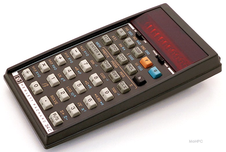 The buttons on the old Hewlett Packard calculator made a satisfying click you could feel when you pressed it far enough to register your number. Why couldn't we augment this with a small light under the button or keypad that flashed when we pressed successfully.
With a clam shell phone, opening it tells the phone that I am ready to use it. Why not take advantage of that information and offer me something (the last number I called?, the phone book number list?...) If the phone is off and the power button is under the clam shell a simple click (not a press and hold) should turn it on. Or better yet if the phone is off and I open it, turn it on!
Screen use
Every pixel is sacred. Use them all and subordinate the screen completely to the current use. So make the number that you are dialing as big as will fit. When you dial/press keys, fill the screen with each digit and then revert to showing the current string of numbers. This way you get lots of clear (anti-aliased) feedback for each number as you dial/press.When the phone is off dedicate the whole screen to the time (or alternate it with the date). If there is additional room, put something useful there (like the the cell phones number!). Who calls themselves? I have taken to printing out my number and taping it to the back of my phone. Remember when all phones had a little strip of paper under plastic that showed its number.
Once a call has connected show both the callers number and my own, so that I can easily respond to the question, "What's your number?"
When the phone "rings" in addition to vibrate, if the phone has a good display; flash the display. A smoothly oscillating glow would look cool.
The shortcut
The best UI idea, which you see everywhere once you know about it, is to offer to do what the user just did, again.* This works because people so often want to do what they just did. Getting the granularity of "what they just did" right is important. But the just called list offers a perfect example.Voicemail should not be on my recent calls list. While voicemail is accomplished by making a call it doesn't really live cognitively in the same space as people-I-call, rather it's a function of the phone (the answering machine). This serves as good example of the importance of getting the cognitive map right.
I want to know who called me recently and who I called recently. These should be easily accessible, possibly driven with a scroll wheel (like the blackberry or the iPod).
The address book should have a dedicated button. And typing number keys to move through the list (2=ABC, 3=DEF, ...) should allow you not just to go to the first letter but subsequent letters when you type the numeric key again.
Voice recognition
Trigger this feature with a single button and give good feedback. A button on the side of the phone dedicated to this so that your finger rests on it when you hold the phone to your ear would be nice. Motorolla's phone before the Razr was pretty good and had a nice ability to take a read phone number and understand it without training. There is plenty of opportunity for good feedback in this feature (e.g. repeating the number quickly). For some reason the Razr went back to a previous much weaker incarnation of voice dialing.Design
- The mute button should be located near the mouth piece (obviously?!) and mute should be indicated clearly. Maybe a red light near the button that toggles the feature.
- We might want to hold this phone, albeit temporarily, between the ear and shoulder.
The phone should be rugged enough to drop to the floor, or be tossed into a back pack. I recently got the Speck case for the Treo and this really adds to the feeling that the phone can be treated with abandon. Plus it can sit on slightly angled surfaces (e.g. dashboard) without slipping to the ground.
- A single button on the outside of the phone should be able to turn off the ringer (toggle ring and vibrate). This is the single best feature of the Treo.
The clock
The phone has a clock in it. Make it a great clock! I like hands on a clock-face, alternate with the date. And provide an easy way to set alarms. Have the phone call you when the alarm goes off. This could all be internal to the phone. Or you could set alarms on the web and have them call your phone when its time. Another opportunity for that oscillating glow.Misc...
- Encourage blue tooth headsets.
- Let me use the camera, if I have to have one, while I am on the phone. Why can't I, while I am talking to someone say, "Hey look at this?"
- Synch well with my computer. No one likes having to enter names on the phone, though when I have to, make it easy to enter a name for the call that I am on currently, or the one just made.
- Make the ring loud enough.
*Even this idea can run up on the rocks as illustrated by the ill-fated adaptable menus in MS Office. Turns out that stability (especially for information that is hidden, like menus) trumps doing what you did last time. They have changed their mind for Office 12 (see The End of Personalized Menus.)
Tuesday, October 10, 2006
Display of Quantitative Information
I am interested in good information display and in why so many attempts at displaying quantitative data are not very good.
Why, for example, are the default graphics in Excel so bad. It isn't that hard to make them better. But that is a topic for another post. I wanted, for now, a place to collect good examples.
Majority Watch nicely illustrates the political balance in the upcoming US elections (uses Flash).
A wonderful computer animation inside the cell. Not strictly quantitative data representation but compelling nonetheless.
Why, for example, are the default graphics in Excel so bad. It isn't that hard to make them better. But that is a topic for another post. I wanted, for now, a place to collect good examples.
Good examples
Edward Tufte the author of Visual Display of Quatitative Information has a terrific web site.Majority Watch nicely illustrates the political balance in the upcoming US elections (uses Flash).
A wonderful computer animation inside the cell. Not strictly quantitative data representation but compelling nonetheless.
Monday, July 03, 2006
Evolution: A User's Guide
I am working on a book project. You can see the drafts at Evolution: A User's Guide http://evousersguide.blogspot.com/.
Subscribe to:
Posts (Atom)